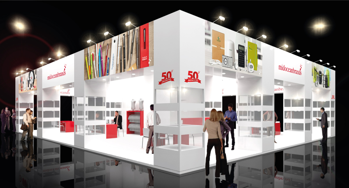
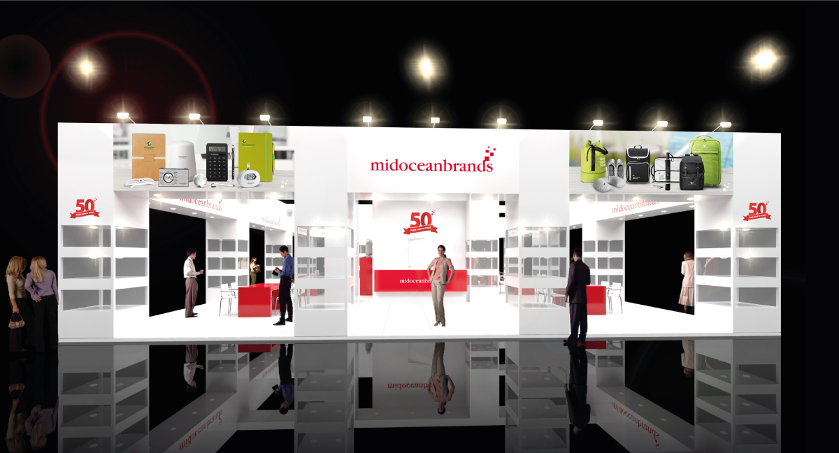
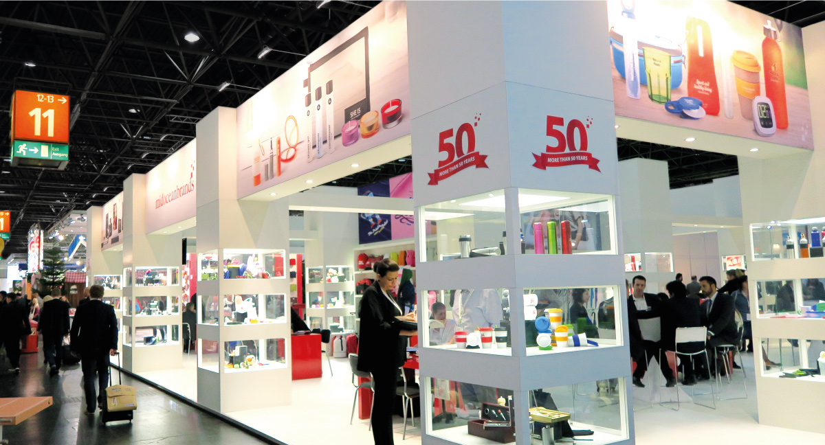
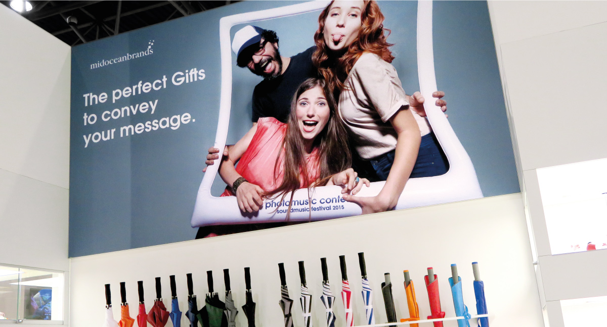
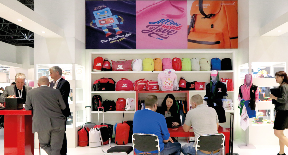
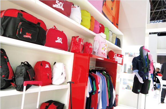
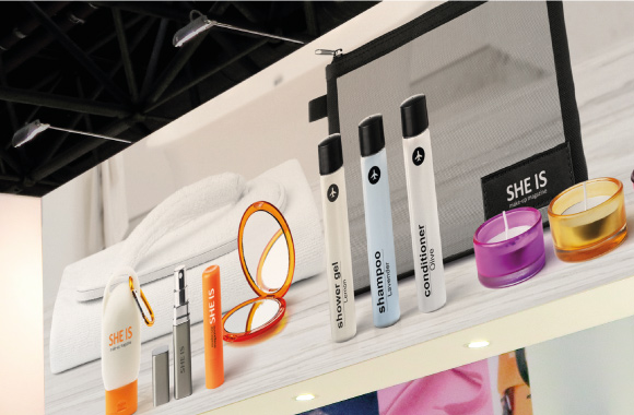
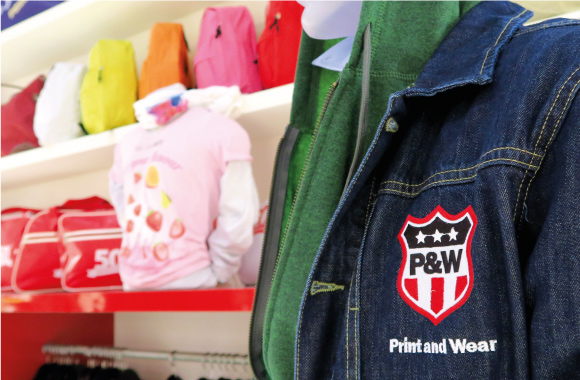
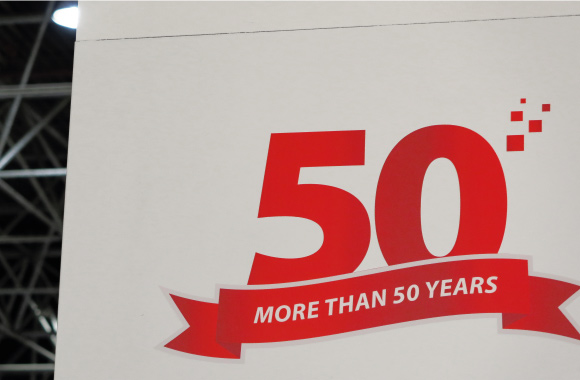
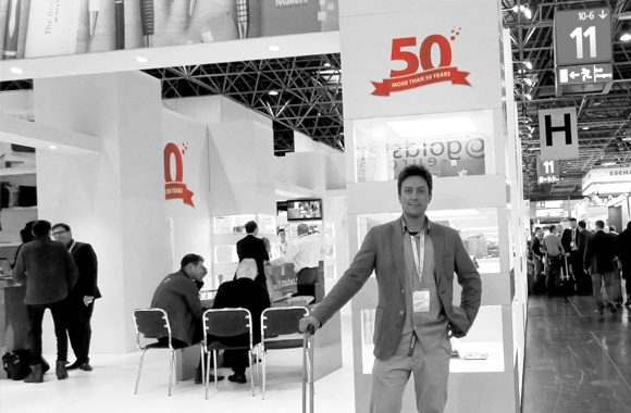
Design of the stand’s graphic.

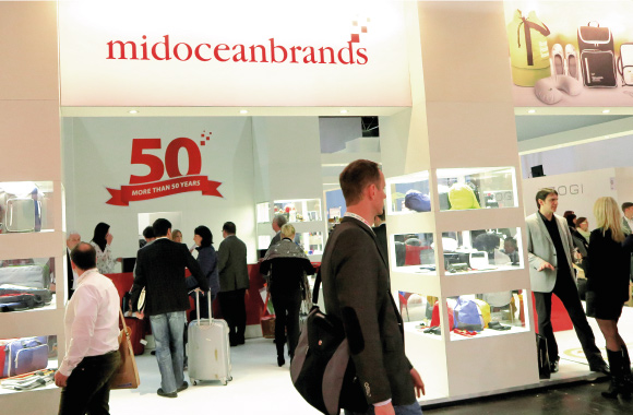
Mid Ocean Brands is one of the most internationally recognized companies in the promotional gift sector based in the Netherlands and offices throughout Europe and Asia, which annually attends PSI Dusseldorf, Europe’s most important promotional gift fair.

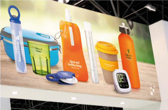
The graphic of the stand was based on the new catalog More than Gifts 2015 that was presented at the fair, which established a connection between the stand, catalog and products. To dress the walls we used images that we created for the catalog.

Clear and clean communication

The showcases contain many products with lots of striking colors, so it was decided to use white as the main color with some details in red, which is the corporate color of Mid Ocean Brands. With this we got a clean image despite having a stand full of different products.

We got a clean image, where visitors could get an idea of the new products that Mid Ocean Brands proposed in their new collection.

For the interior walls, images of details of the new products were created, which gave an idea of which collection they were in one or another area, establishing a route within the stand.

Really a pleasure to be present in the international launching of the work that we have done during the last months. Is great to see how people open the catalogue when they receive it.

Alfonso Martinez. Art Director

Was great to create all this graphic stuff for Mid Ocean Brands, and important international fair like PSI Dusseldorf.

Irene Mercader. Graphic Designer