
CTCO Lyon 2026: Design, Identity, and Experience at SOLO’s Stand
A proposal that reflects SOLO’s identity and the value of design applied to exhibition
At CTCO Lyon 2026, it became clear that trade shows are no longer limited to showcasing products: it’s about creating spaces that are lived. And one of the stands that understood this best was SOLO’s.

Building Experiences
Design makes sense when form, function, and identity speak the same language, creating spaces that connect.
Seeing our catalogues alongside those of SOLO and Neo BLUE reinforces this shared vision and the synergy between them.
The goal: coherent, strong, and memorable projects, built through design and collaboration.
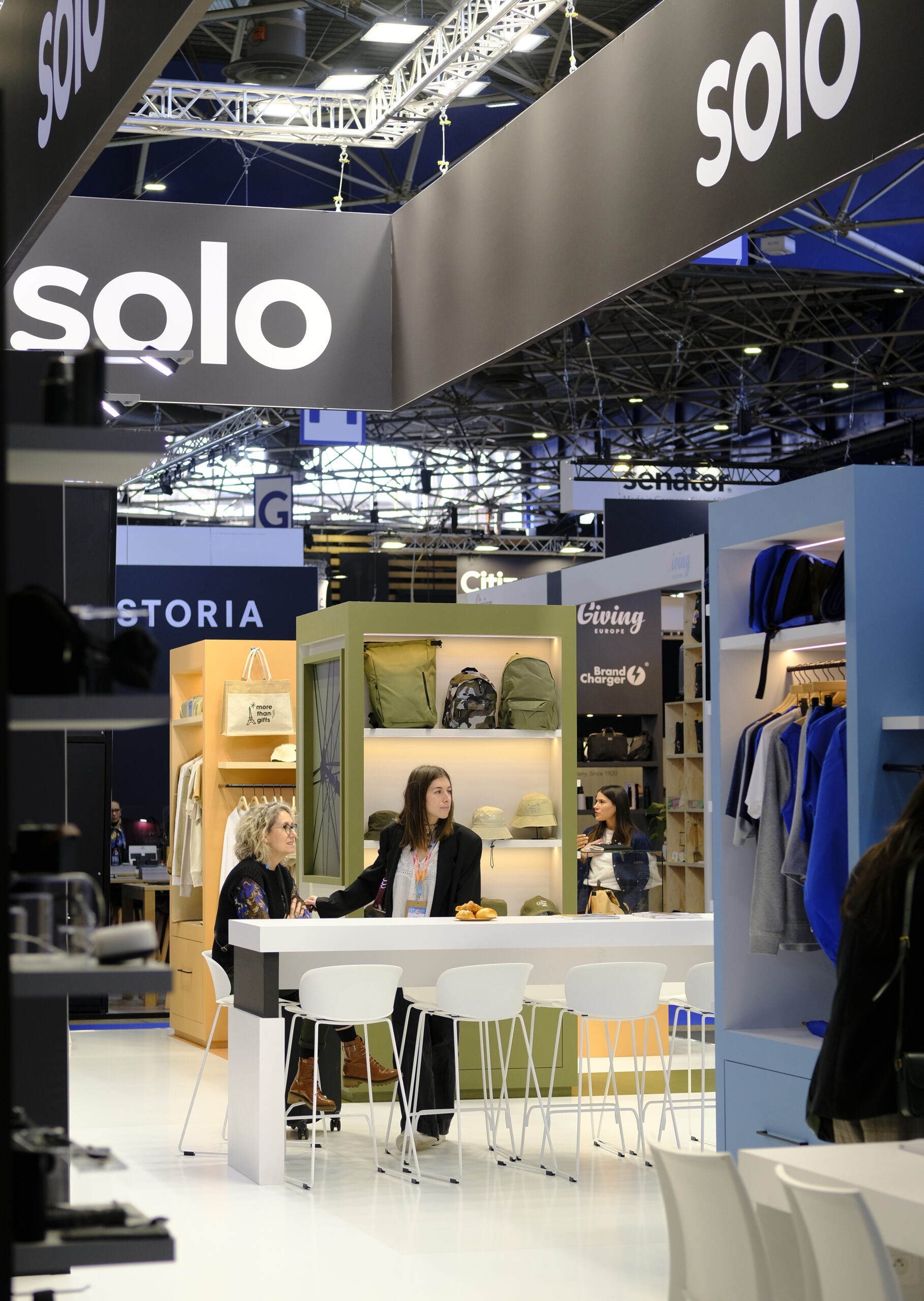
A stand that functions as its own space
SOLO’s stand felt less like an exhibition and more like a carefully designed environment. Its layout, materials, and warm lighting created a fluid, immersive, and elegant atmosphere.
The thoughtful arrangement turned each piece into part of a cohesive story, inviting visitors to pause, observe, and truly discover amid a stimulating setting.

A traditional moment: our Art Director and the catalogues
During the fair’s traditional photo moment, our Art Director was captured with the catalogues, highlighting the tangible value of print in a world dominated by screens. The catalogues not only present the product range, but also convey the visual identity and storytelling that define SOLO’s world.
For us, this project reinforces design as a strategic tool—one that goes beyond aesthetics to shape perception, strengthen identity, and align every element with clear intention. Above all, it confirms our belief in design meant to be experienced and lived, where each catalogue becomes a tactile and emotional expression of the brand’s essence.


Balance between aesthetics and functionality
The proposal stood out for its balance between design and usability. The space allowed for comfortable circulation and clear visibility of the pieces, while maintaining a warm and elegant atmosphere.
The result was a clean and contemporary stand that did not lose personality or identity, aligned with SOLO’s visual identity.

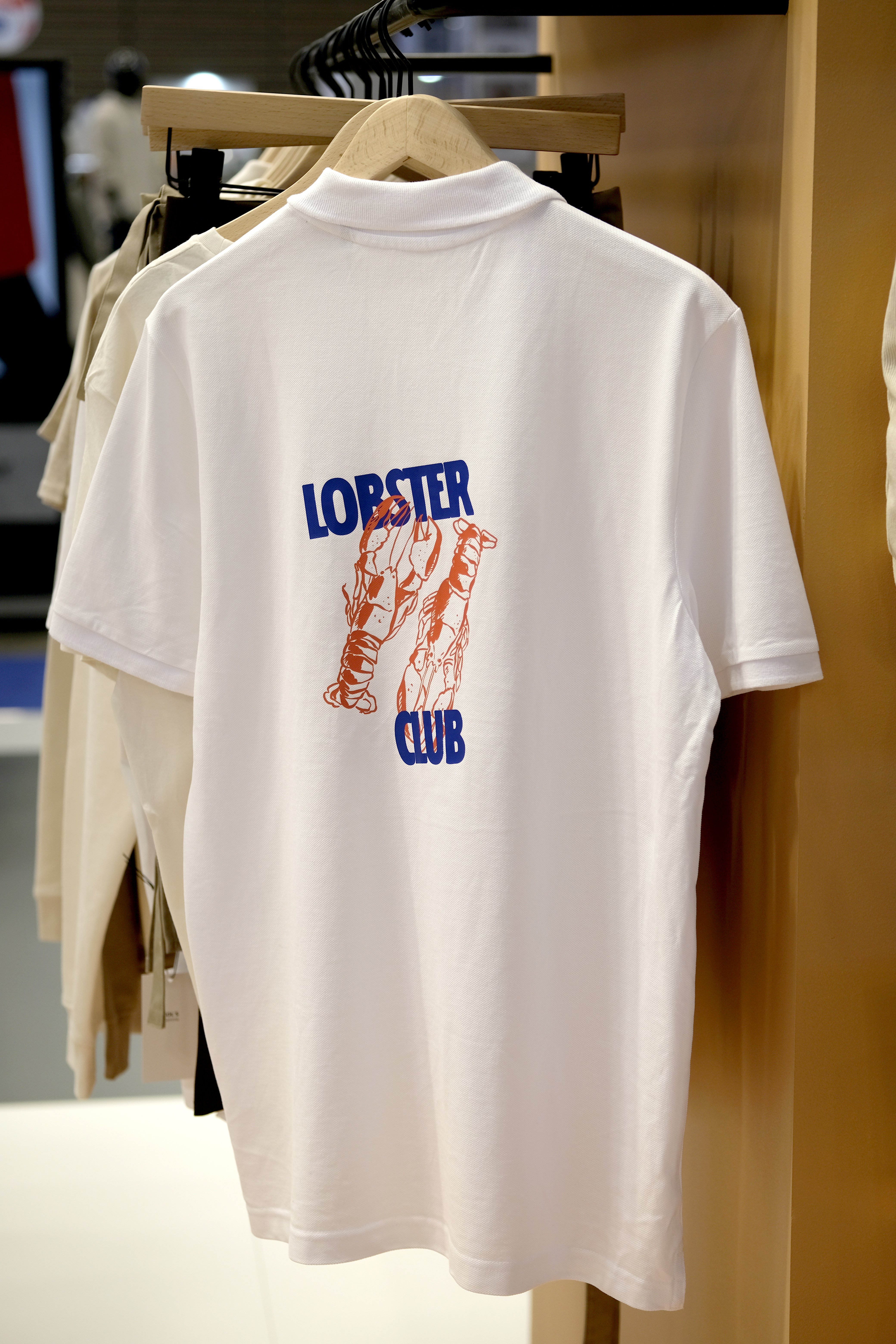
Personalization as a brand language
What stood out most was how personalization became the protagonist, turning each accessory into a clear expression of intention and brand narrative. Through Solo, personalized designs reached an elevated level of refinement, where typography, finishes, and patterns felt deliberate and aligned with the brand’s aesthetic. More than customization, it was design that strengthened identity—proving that good design is not only seen, but felt.